
Website Development Mobile
Mobile Website: Why Your Phone Traffic Decides Conversion and How to Fix It
55–70% of traffic is smartphones, yet many sites lose leads on them. We break down what a mobile site must be in 2026: mobile-first indexing, Core Web Vitals, tap targets, forms, clickable contacts and a fix checklist.
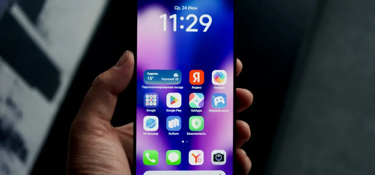
Short answer: if your site is awkward on a phone, you lose more than half of potential customers. Google indexes sites by their mobile version (mobile-first), and a slow or “tiny” mobile page hurts both rankings and conversion. Below are concrete 2026 mobile requirements and a checklist to recover sagging leads in one sprint.
The numbers that explain everything
If mobile conversion is clearly lower than desktop, it’s almost never “mobile users don’t buy” — it’s “the mobile version stops them buying”.
1. Mobile-first: design from the phone
Start from the narrowest layout (320–375 px): what matters most goes on top. Then scale up to tablet and desktop. The reverse approach (“build desktop, then squeeze”) produces overloaded mobile pages.
2. Speed: Core Web Vitals on mobile
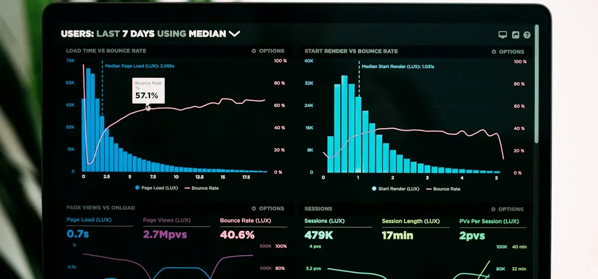
Mobile traffic is often 4G and a mid-range phone, not a fast desktop. Targets: LCP ≤ 2.5s, INP ≤ 200 ms, CLS ≤ 0.1. The main mobile killers:
- heavy images without WebP/AVIF and without
width/height(that’s CLS too); - dozens of third-party scripts (chat, pixels, map) blocking the main thread;
- hydrating the whole page for two buttons.
How to fix it — in the how website speed affects revenue guide.
3. Tap targets and navigation
- Buttons and links — at least 44×44 px, spaced apart (fingers mis-tap).
- Menu — a burger with a large tap area; there’s no “hover” on a phone.
- A sticky bottom bar with the main action (“Call”, “Order”) lifts conversion.
- No full-screen pop-ups — Google demotes intrusive interstitials.
4. Forms that fill in on a phone
In practice: on mobile, 1–2 fields plus a tap-to-call number beats a long “perfect” form.
5. Readable without zooming
Base font ≥ 16 px, WCAG contrast, short paragraphs, subheads. Text people only read by zooming is both bad UX and a low-quality signal to search.
Mobile version checklist
What this looks like in practice
At Solomia Beauty a 2-step mobile checkout with fast filters and 200 ms search was one reason behind +180% conversion; at Verkhovyna 24/7 mobile online booking delivered 2.5× bookings, because a request can be sent from a phone anytime. The mobile version isn’t “adapt the picture” — it’s the path to money.
Bottom line
The mobile version is your site’s primary version for Google and for most customers. Fast, tappable and with a short form, it converts; slow and “tiny”, it drains more than half your traffic. Run the checklist above — the fixes often pay back in the first month.
Get a mobile audit → — within 24 hours we’ll show where the phone loses leads and what to fix. Read next: why your website doesn’t convert and how speed affects revenue.
from $1,100
Need the same solution for your business?
Bespoke design and lively animations on Astro, React, Vue and Angular: corporate sites, landing pages and promo sites impossible to mistake for templates.
- Custom design from scratch
- GSAP/ScrollTrigger animations
- 90+ Lighthouse speed
Get a free website audit in 48 hours
Speed, SEO, conversion — a 12-page report with a prioritized fix plan. No obligation, no spam: we show what to improve even if you never hire us.
- Core Web Vitals & speed
- SEO structure & content
- Conversion paths & UX